Moving Industry Statistics

According to US Census data, 12.1% of Americans moved in 2023, with 2.3% heading out of state. That’s almost 41 million people representing $19 billion of annual spending on moving services.
To better grasp how much the moving industry affects just about everything, we’ve compiled some of the most thought-provoking moving industry statistics from 2023 and 2024 — and even so far in 2025.
General moving industry statistics
- The average American moves 11.7 times in their lifetime. [1]
- According to new Census data, nearly 41 million people — or 12.1% of all Americans — moved in the United States in 2023. [2]
- Over 2% of movers headed to a new state, which means that approximately 7.7 million Americans made interstate moves in 2023. [3]
- While 12.1% of all Americans moving may seem like a lot, it’s a lower percentage than most years since the census began keeping track of annual moves in 1948. More Americans moved annually from 1948 until the early 2000s than they did last year. [4]
- Today, just over half as many people move each year as they did in the 1950s. [4]
How much does moving cost?
We crunch the numbers for both local and long-distance moves: [5]
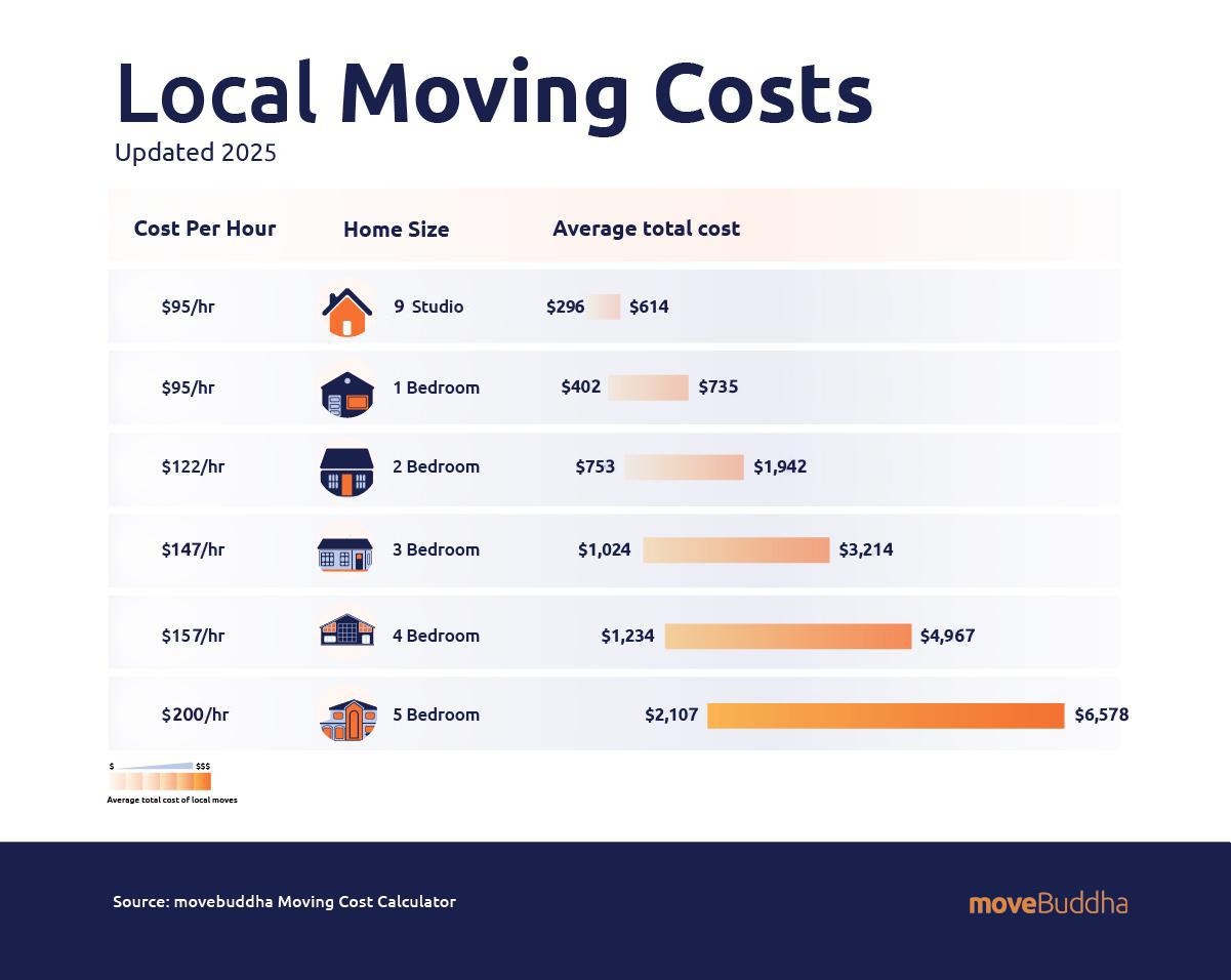
Local moving costs
- Local moving companies charge by the hour, with rates ranging from $65 up to $251 per hour.
- Depending on the size of the move, hiring professional movers for a local move will cost on average anywhere from $301 to $3,512.
Long-distance moving costs
- With long-distance moving companies charging by weight, prices can range from $2,509 to $11,641, depending on the size of the move and the distance.

Related: Moving Cost Calculator
The logistics of moving
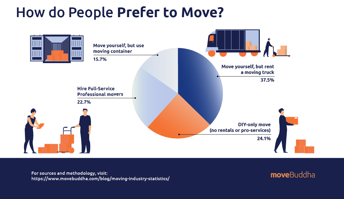
How people move
moveBuddha conducted a Google Survey of 1,500 people in the U.S. asking, “If you have moved or were to move homes, how would you choose to move?” The responses are as follows:
- Move yourself, but rent a moving truck: 37.5%
- DIY-only move (no rentals or pro-services): 24.1%
- Hire Full-Service Professional movers: 22.7%
- Move yourself, but use moving containers: 15.7%
Related: Best Moving Container Companies
When people move
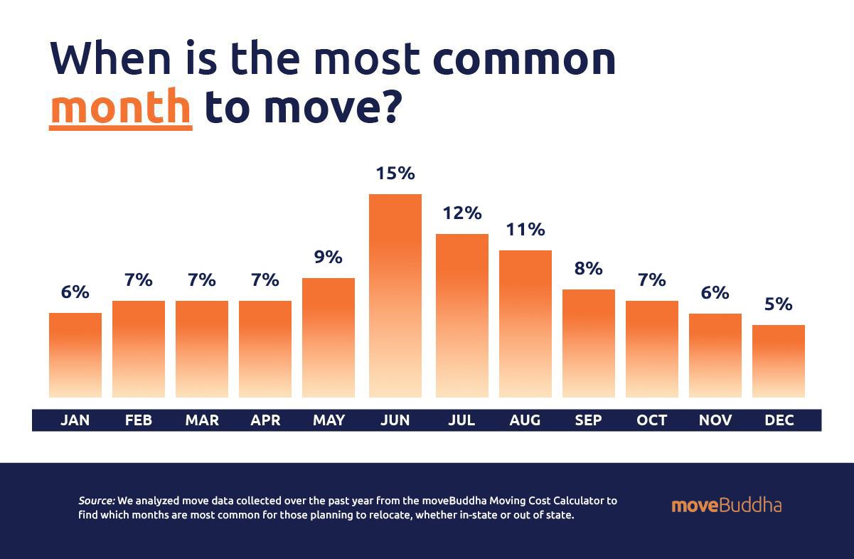
- June is typically the most common month for people to move.[7]
- Summer is by far the busiest time of year to move, with 41% of annual U.S. moves taking place between May and August. [7]
- The busiest dates to move are June 1st and 30th, while September 1st and 30th come in slightly behind. [8]
- June is also the busiest month for move planning, regardless of when people plan to relocate. It accounts for nearly 15% of total move planning.[7]
Related: Moving Cost Calculator
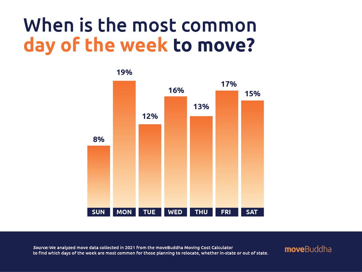
Most common day of the week to move
Mondays are the most common day of the week to move with 19% of moves taking place on Mondays.
- Sunday 8%
- Monday 19%
- Tuesday 12%
- Wednesday 16%
- Thursday 13%
- Friday 17%
- Saturday 15%
And while we know that weekends are often considered the most popular time for people to move, here’s the percentage of moves scheduled by day of the week: [6]
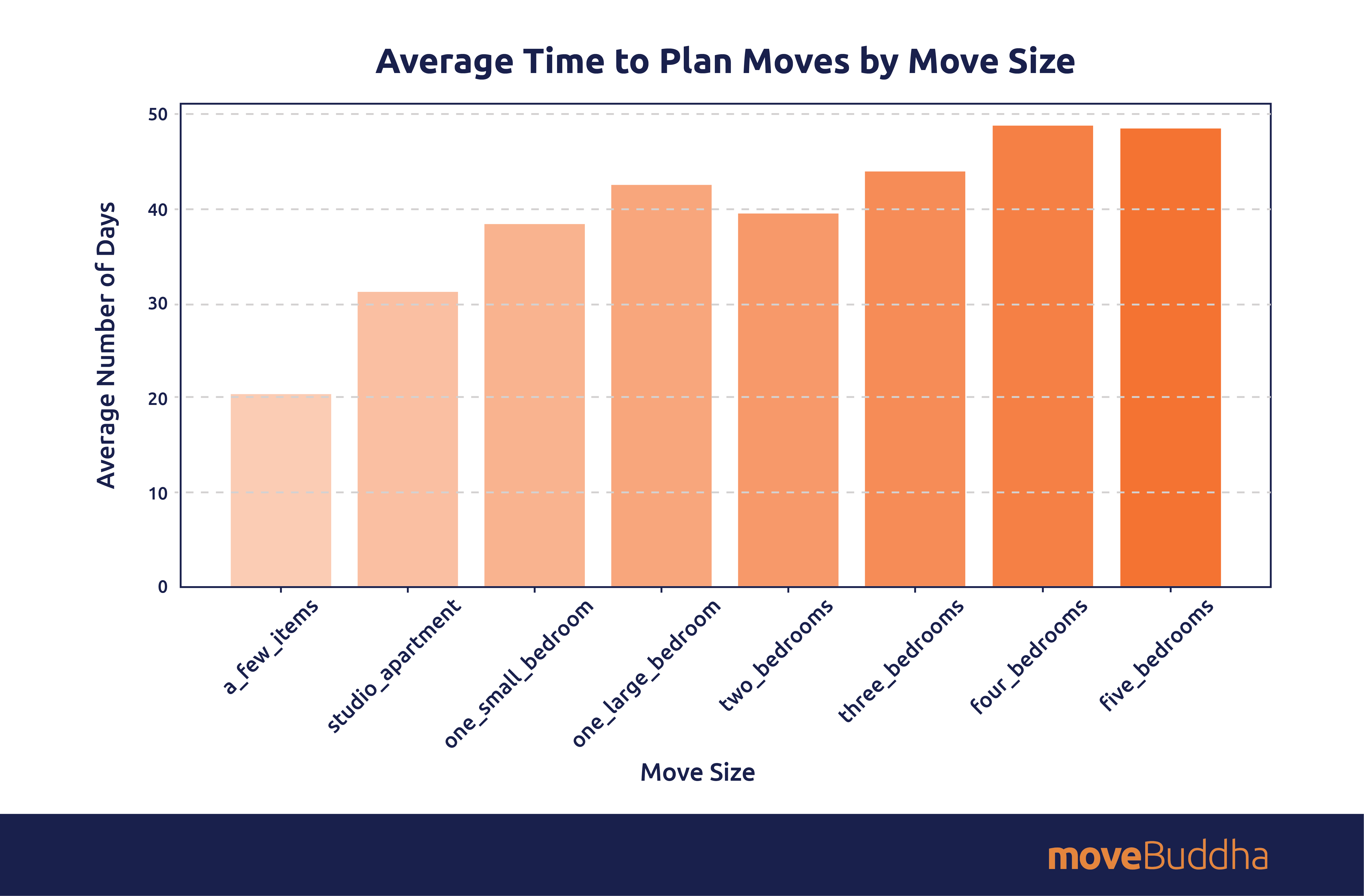
How people plan their moves
There’s as much diversity in move planning styles as there are movers. Here are the numbers:
- Movers plan an average of 29 days in advance, as most movers engage in an “end of the lease” scramble. [7]
- Movers with less stuff are most spontaneous. Half of movers who are planning on taking “just a few small items” plan their moves in just 13 days or less. [7]
- Larger moves are planned earlier, with 5-bedroom moves planned on average 76 days in advance and 25% of those moves planned at least 90 days ahead. [7]
- Studio and one-bedroom moves are planned an average of 60 days ahead. [7]
- April planners lead the way: they spend the most days — 19.9 more days — than the January basesline — planning their moves. The shortest lead time? July movers. They give themselves 18.3 fewer days than the norm. [7]
Where people move
Where are movers heading? Among those planning a move:
- Over half (49.87%) of moves within the past year were in the same county, and roughly 75% of movers stayed within the same state: [8]
- 49.87% moved within the same county (same state).
- 25.19% moved to a different county (same state).
- 18.88% moved to a different state.
- 6.06% moved to a different country.

- When analyzing the number of miles traveled, we found that the average distance moved over the past year was 309 miles. Though there’s been a drop in overall moves between 2021 and 2024 [11] we’re seeing that those people who are relocating are moving farther distances. Here’s the full breakdown: [6]
- moved 1-100 miles
- moved 100-500 miles
- moved 500-1,000 miles
- moved 1,000-2,000 miles
Over the past year, the average distance for interstate moves was 569 miles, while in-state moves averaged 95 miles, and relocations within the same city averaged just 2 miles.
Related: Best Interstate Moving Companies
-
- Looking only at interstate moves, people who relocate the furthest distances are moving from: [6]
- Alaska: 3,727 miles
- Hawaii: 3,590 miles
- Washington: 2,042
- Meanwhile, those relocating the shortest distances are moving from: [6]
- West Virginia: 878 miles
- Delaware: 892 miles
- Mississippi: 915 miles
- The busiest city-to-city moving routes according to 2024 data are between these cities (5 of which originate from California): [11]
- Looking only at interstate moves, people who relocate the furthest distances are moving from: [6]
| Rank | Busiest City-to-City Moving Routes |
|---|---|
| 1 | Myrtle Beach, SC to Hagerstown, MD |
| 2 | New Haven, CT to New York, NY |
| 3 | San Jose, CA to Seattle, WA |
| 4 | Charleston, SC to Charlotte, SC |
| 5 | San Francisco, CA to New York, NY |
| 6 | Allentown, PA to New York, NY |
| 7 | San Jose, CA to Austin, TX |
| 8 | Austin, TX to Seattle, WA |
| 9 | Seattle, WA to San Francisco, CA |
| 10 | Salt Lake City, UT to Dallas, TX |
What states are people moving to?
What was the most moved to state in 2024?
- That distinction goes to South Carolina, with an in-to-out-move ratio of 2.04 [12] and a net domestic migration gain of 105,276. [13]
What were other top move-to states in 2024?
- The states with the most moves either in or out are often the largest. In 2024, when looking at the sheer volume of population influx, Texas and Florida were the biggest winners, with Arizona, California, Georgia, New Jersey, New York, North Carolina, and Washington all netting over 100,000 new residents. [14]
But the influx in net numbers includes both international migration and new births — and it favors the largest states. It doesn’t necessarily reflect where Americans are moving on a per capita basis.
Here are the top and bottom 10 states that stood out as winners and losers for state-to-state moves: [12]

Which states received the highest proportion of moves in vs. out?
When we look more specifically at the comparison of moves in compared to moves out of each state — the “in-to-out ratio” — we can see which states are gaining the most residents while retaining their existing population, or the inverse. [12]
- Which states are earning higher proportions of inflow? South Carolina, North Carolina, and Maine stood out as especially popular in 2024. The 10 states receiving the highest ratio of inflow in 2024 were:
| Rank | State | In-to-out Ratio |
|---|---|---|
|
1 |
South Carolina |
2.05 |
|
2 |
North Carolina |
1.73 |
|
3 |
Maine |
1.62 |
|
4 |
Tennessee |
1.60 |
|
5 |
Idaho |
1.59 |
|
6 |
Arkansas |
1.58 |
|
7 |
Wyoming |
1.55 |
|
8 |
West Virginia |
1.52 |
|
9 |
South Dakota |
1.46 |
|
10 |
Alaska |
1.36 |
- And these are the 10 states that are seeing proportionally higher outflow according to the in-to-out ratio in 2024:
|
Rank |
State |
In-to-out Ratio |
|
1 |
California |
0.48 |
|
2 |
New Jersey |
0.63 |
|
3 |
Rhode Island |
0.65 |
|
4 |
Connecticut |
0.70 |
|
5 |
Massachusetts |
0.80 |
|
6 |
Illinois |
0.80 |
|
7 |
North Dakota |
0.82 |
|
8 |
Maryland |
0.82 |
|
9 |
Nebraska |
0.83 |
|
10 |
Louisiana |
0.83 |
Which states are more popular or less popular from year to year?
In our Migration Report, we examined which states were increasingly popular and which were slipping in popularity as we moved from 2023 into 2024. [12]
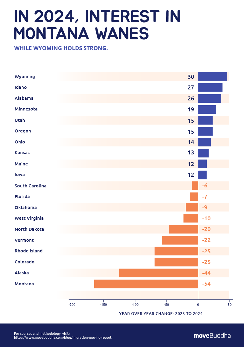
- The states with the highest percentage change of inbound to outbound moves between 2023 and 2024 were:
- Wyoming: 30
- Idaho: 27
- Alabama: 26
- Minnesota 19
- Utah: 15
- Oregon: 15
- Ohio: 14
- Kansas: 13
- Maine: 12
- Iowa: 12
- And here are the states that lost popularity, with the lowest percentage change of inbound to outbound moves from 2023 to 2024:
- Montana: -54
- Alaska: -44
- Colorado: -25
- Rhode Island: -25
- Vermont: -22
- North Dakota: -20
- West Virginia: -10
- Oklahoma: -9
- Florida: -7
- South Carolina: -6
State migrations
At moveBuddha, we’ve done a lot of research on the states that are seeing the most migration traffic. Here we share some key highlights from our reporting and analysis of the most popular states to move to and from.
- From 2023 to 2024, Texas grew by 562,941 residents — more than any other state. [15]
- More than 1 in 4 moves into Texas in 2022 are from California. [16]
- 11.3% of exiting Californians make the move to AZ. [17]
Tennessee: Follow Me to Tennessee
- Tennessee’s popularity surged to an unbelievable 3.2 new moves per exit in 2020. While growth has slowed, in 2024, the Volunteer State still gets 1.59 new volunteers looking to relocate for each resident ready to leave. [12]
- Nashville is especially popular to move to in 2024, ranking #6 as a destination city for metro-to-metro moving routes 2024. [18]
South Carolina: Palmetto Paradise
- 2023 and 2024 both saw the state on top for in-to-out move interest, but Texas and North Carolina both netted more new residents overall. South Carolina said hello to 68,043 newcomers. [12]
- Charlotte-Concord-Gastonia, the metro straddling North and South Carolina is the South Carolina city most likely to be the destination on this year’s popular move routes. Movers from Charleston, New Orleans, and Raleigh all have their eyes on the destination. [11]
New Jersey: Garden State Exits
- 2024 data for state-to-state moves shows that for every 64 moves into New Jersey, there are 100 out – greater outbound traffic than any other state except California. [12]
- More than 17% of New Jersey outmoves head to Florida, more than any other destination. The top 3 states for New Jerseyans headed out in 2023 are Florida, Pennsylvania, and New York. [19]
California: Golden State Exodus
- 2024 data for state-to-state moves shows that for every 46 moves into California, there are 100 out. [17]
- Where are they heading? Texas tops the list. [17]
- The top most searched routes out of California are from San Jose to Seattle, WA; San Francisco to New York City; and San Jose to Austin, TX. [17]
North Carolina: Carolina in Our Minds
- With 1.73 in-moves for every exit, North Carolina’s popularity has cooled from previous years, but remains the 2nd most popular destination state today. [12]
- Cary, WIlmington, and Asheville metropolitan-area cities are especially popular for 2024 inbound moves. [12]
Who is moving
- According to U.S. Census migration data, the average age of people moving in 2023 was 23.4. Movers between 25 and 29 years old are the most likely group to relocate in 2023. They were 405% more likely to move last year compared to those over 45 years old. [20]
- Who’s moving more, renters or homeowners? Renters move quite a bit more than homeowners, making up about 64% of moves, while homeowners comprise around 36% of America’s moves. [20]
- In 2023, never-married people were 42% more likely to move compared to their married counterparts. That same isn’t true for divorced folks — they were 74% less likely to move. [20]
Why people move
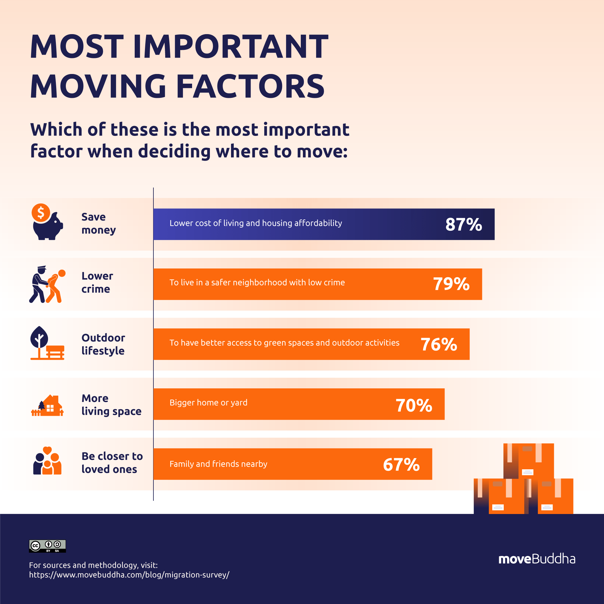
- According to our 2025 move survey: [21]
- Americans would consider moving in 2025 in order to:
- Save money (61.22%)
- Live in a neighborhood with lower crime (49.58%%)
- Have better access to an outdoor lifestyle (42.39%).
- The most desirable moving destination is the suburbs. 29.32% of respondents said it’s the environment they’d prioritize for a move in 2025.
- Among those with incomes <$50,000, more prefer “a rural area with peace and quiet” while both middle income ($50,000 to $150,000 and over $150,000 income households) prefer the ‘burbs.
- Already got it: Southerners are most indifferent to moving to experience a warmer climate (17.17% say it doesn’t motivate them at all), while 19.41% of Northeasterners are unconcerned with moving to a place with more culture, museums, and festivals.
- Every single region ranks “saving money” their top moving motivator — all regions ranks it at least 18 points above their next priority.
- Americans would consider moving in 2025 in order to:
Millennials on the move (or not)
Since the Great Recession of 2008, millennials — young adults aged 29 to 44 — have felt the full effect of the resulting housing and job crises. This has affected their mobility, with migration rates for this group continuing to stagnate through the pandemic.
- For millennials aged 29-44 local migration dropped from a pre-2010 rate of 14-15% down to 10% in the year before the pandemic, and down to 9.4% in 2021. Likewise, long-distance migration decreased from 6-7% in 2006 to 5.8% in 2021. [14]
- Today, the millennial mobility rate is low, with just over 10 million 25-44 year olds making a move in 2023 (about 11.3% of the entire age group). [20]
- Despite millennials’ propensity to stay put, young adults were the most likely to relocate during the pandemic: [23]
- 32% of Gen Zers (ages 18-24)
- 26% of millennials
- 10% of Gen Xers (ages 41-56)
- 5% of baby boomers (ages 57-75).
- Only 42% of millennials between the ages of 25 and 35 are married and living with their spouse. That’s compared to 82% of members of the Silent Generation who were the same age in 1963. [24]
- Three in ten millennials live with a spouse and children, compared to 40% of Gen X at the same age. [25] In fact, 30% of millennials and Gen Zers say they do not want children at all. [26]
- Millennial homeownership rates are just 45.5%, much less than their older counterparts, at around 20% lower than the rate for Gen X, and nearly 30% less than for Baby Boomers. [27]
- 60% of millennials say they would be willing to take a pay cut to move to their dream location. [28]
- Considering all of these factors, why are millennials moving less than previous generations? Economists think there are a few factors, but the biggest ones are that there are fewer job market opportunities for this generation, plus millennials largely can’t afford to buy homes, which makes them less motivated to move. [24]
Moving industry: The economics
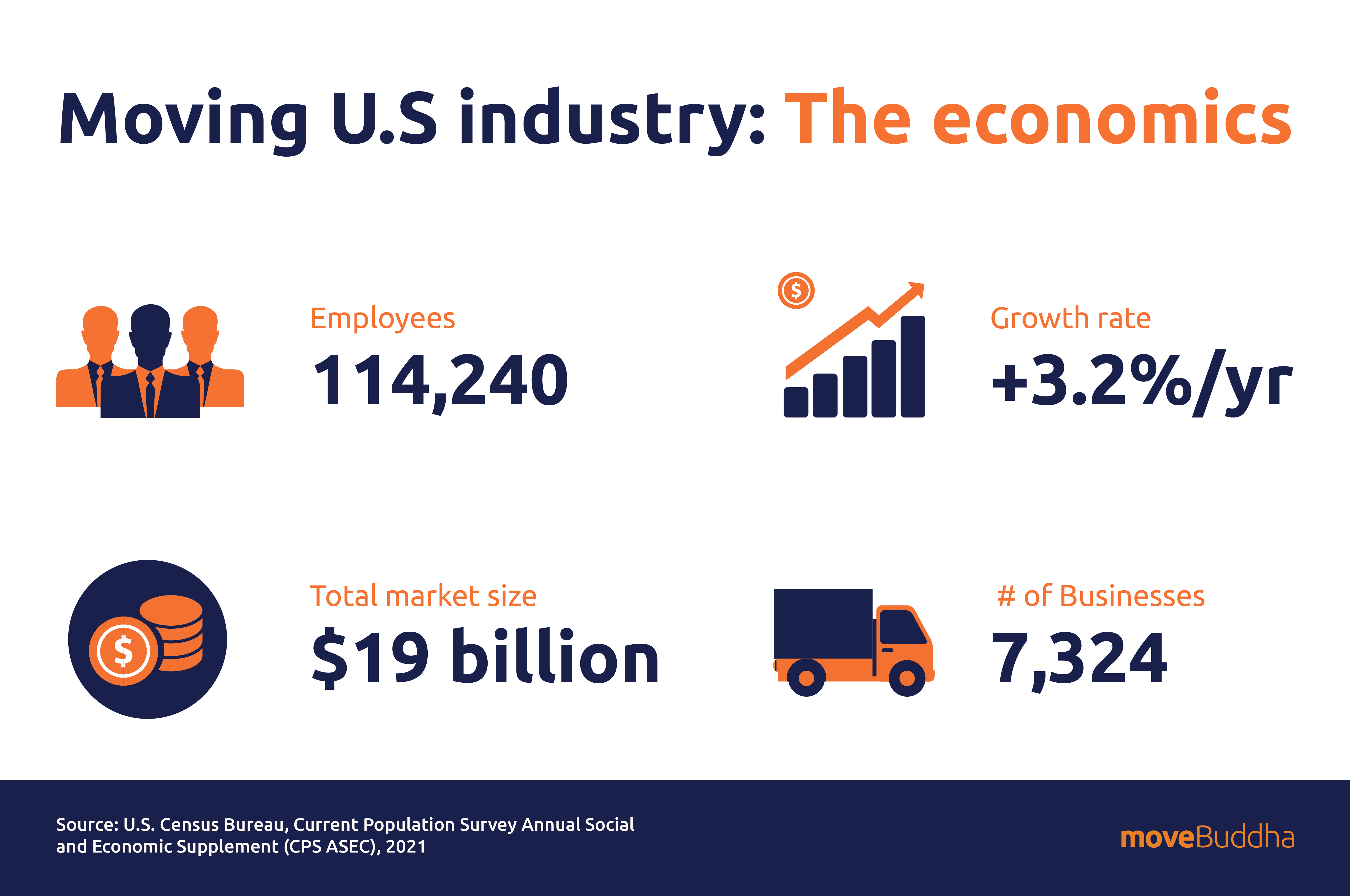
- Moving companies are officially in the Moving Services Industry. The Moving services industry is the 18th largest category of the Transportation and Warehousing Industry.
- The U.S. moving services industry employs 106,000 people for a total market size of $23.3 billion. [29]
- Over the past 5 years, the industry has grown at an average annual rate of 6.8%. [29]
- Because the moving industry is predominantly composed of small businesses employing fewer than five employees, there are a lot of moving companies out there — currently 7,667 businesses. [30]
- The moving services market share is expected to reach $110.97 billion from in 2025. [31]
- The housing sector is growing, with new single-family home sales reaching 660,000 in January 2024 and families more likely to relocate due to lifestyle, work, weather, and politics. [32]
- The moving industry generated $32.2 billion in direct economic activity and a total sum of $92.2 billion in economic activit, including indirect and induced activity. [33]
- Closely related to the moving industry is the self-storage industry, which generates around $23.6 billion in revenue each year in the U.S. [34]
- Over 11% of American households rent storage units. [34]
There are nearly as many storage facilities (52,301) in the U.S. as there is a combined count of Starbucks, McDonald’s, Dunkin’ Donuts, Pizza Hut, and Wendy’s restaurants (52,431). [34]
How much waste does moving create?
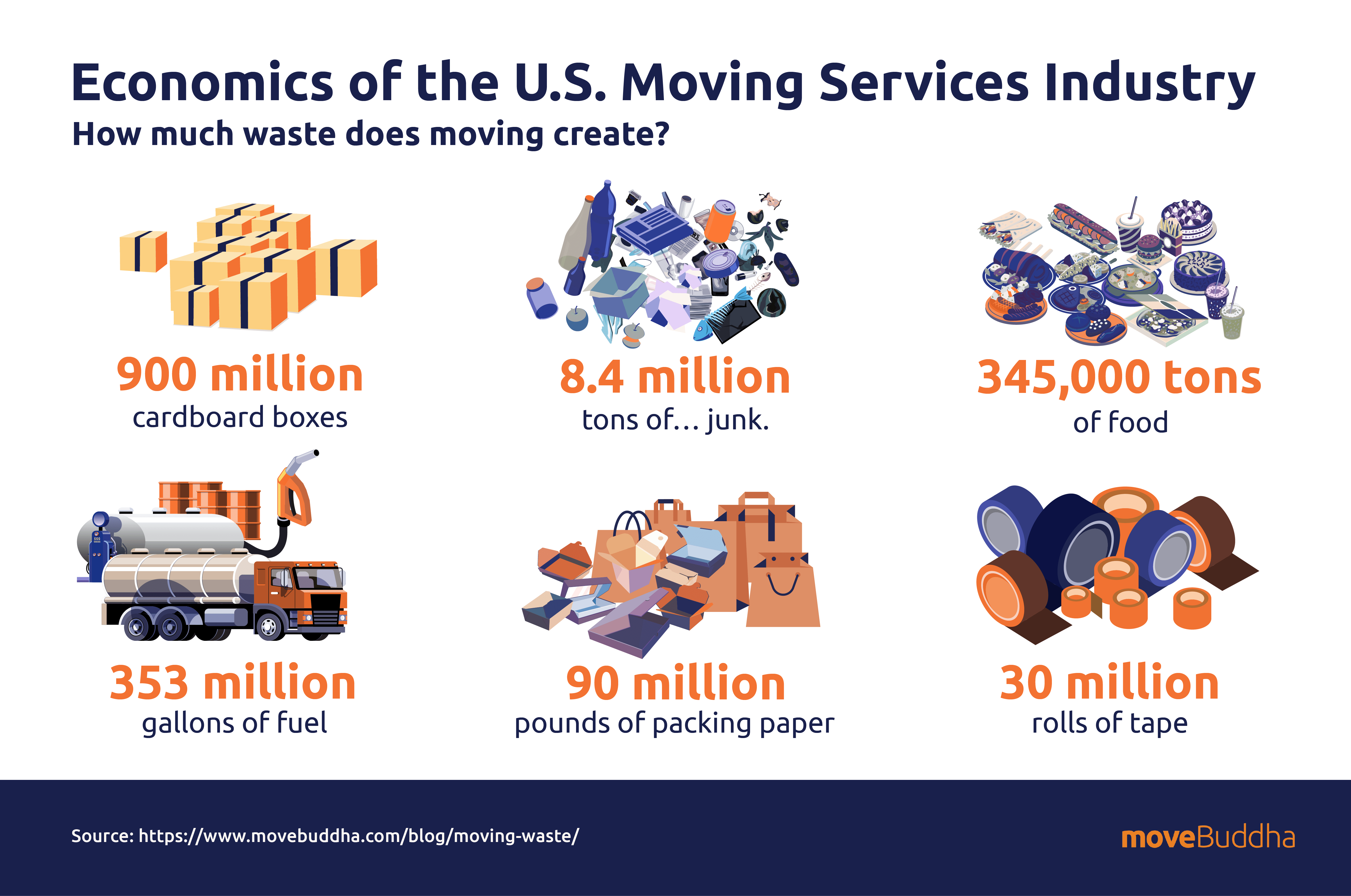
Moving creates more waste than most of us realize. Understanding this is the first step to doing something about it in your next move.
- This is how much estimated waste is generated in moves across the country each year: [24]
- 900 million cardboard boxes
- 8.4 million tons of… junk. This includes all of the things sitting in cabinets, drawers, and garages that get thrown out.
- 345,000 tons of food
- 353 million gallons of fuel
- 90 million pounds of packing paper
- 30 million rolls of tape
How the pandemic affected the moving industry
When the COVID-19 pandemic first ripped through the nation, home and work lives were upended. The advent of more flexible working arrangements and the desire to be closer to family meant that many people chose to relocate either permanently or temporarily.
- With this increased need for relocation services, moving businesses struggled in 2021 to meet demand in an economy plagued by worker shortages, rising fuel costs, and health concerns: [25]
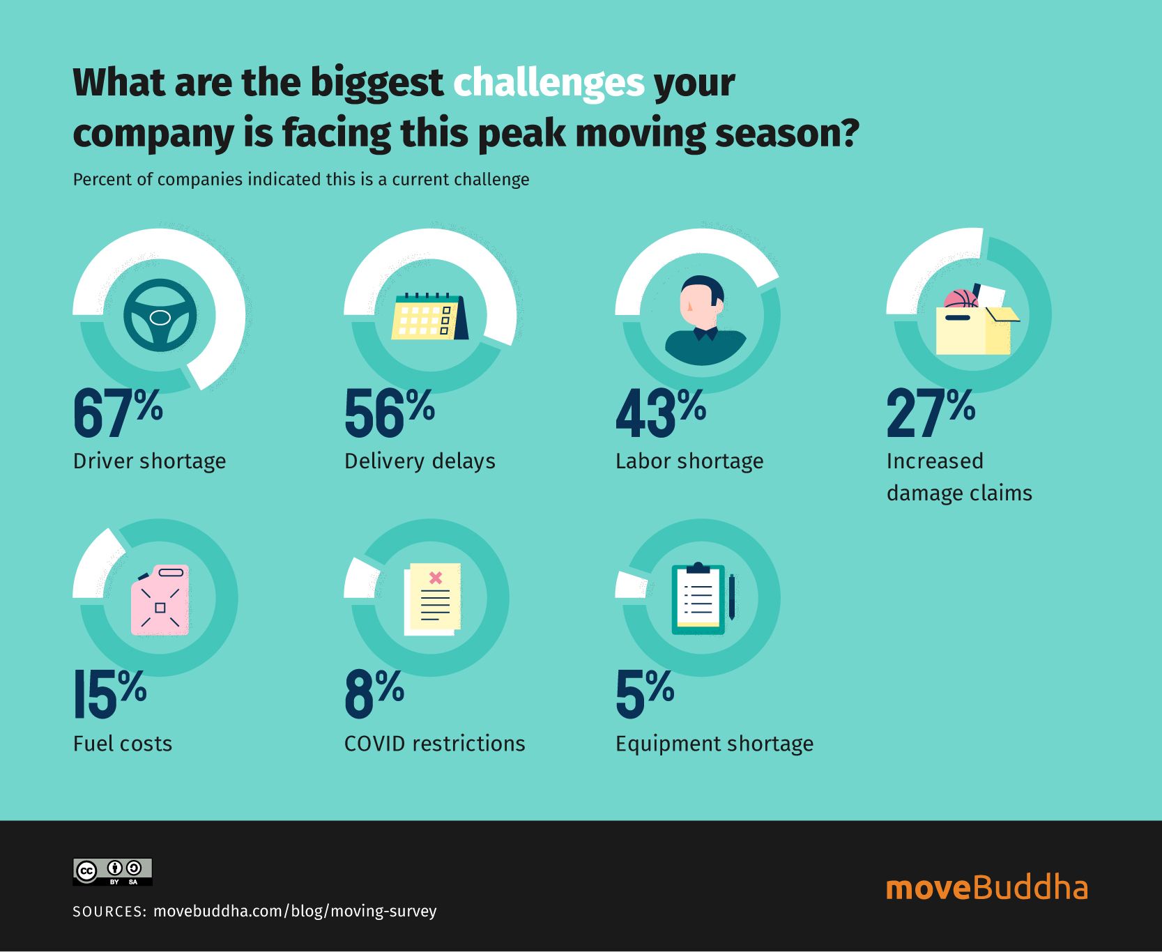
- 67% of moving companies reported driver shortages, which many attribute at least partially to pandemic-related job loss.
- 71% of moving companies reported experiencing delays in 2021 that exceed what is normal for the peak moving season.
- Nearly half of all moving companies were booked out at least three weeks farther than in previous seasons.
- Customer complaints about cancellations rose 250% in 2021 compared with 2019.
- Nearly 40% of the reported moves in 2021 were influenced by either remote work policy or COVID-19.
Moving trends, moving forward
Where are we now? In the post-pandemic era, Americans are moving less than ever. [37]
While it’s difficult to project what long-term changes to American mobility are yet to come, it’s likely the hypermobility of COVID-19 is over.
If there’s one thing that seems certain, it’s that relocations continue to favor:
- Southeastern States, with search volume staying high in sun-belt, low-tax destinations as states like North Carolina garner the highest volume of in-move interest, with neighbor South Carolina holding on to the highest ratio of in-moves versus moves outbound in 2024. [37]
- Low-cost locales. While 1 in 4 Americans wants to live in California, the high-cost, high-tax coastal haven remains among the bottom 3 states with the highest out-move interest versus searches inbound (and has been on that list since 2020). [26]
Some of the major moving industry trends we’ve seen over the past couple of years will likely carry on: for instance, the exodus from large cities and into suburban areas. These types of moves will continue in part due to people seeking more affordable housing as prices continue to trend up — along with “back to office” dictates.
With limited housing, and more people on the move in pursuit of an affordable life, there’s reason to believe moving trends will continue to favor smaller regional hubs, sprawl into the suburbs and towns with low prices compared to trendy downtown enclaves, and cities with tons of new housing starts, keeping prices reasonable.
But as more newcomers discover these secrets, we expect the list of trending locales to continue to shift. After all, moving trends are never static, and new cities catch movers’ eyes as they shift their priorities, and as cities and states themselves adapt to welcome them.
Sources:-
- U.S. Census Bureau, “Calculating Migration Expectancy Using ACS Data.”
- U.S. Census Bureau, “United States Migration/Geographic Mobility at a Glance: American Community Survey 1-Year Estimates.”
- U.S. Census Bureau, “United States Migration/Geographic Mobility at a Glance: American Community Survey 1-Year Estimates.”
- Brookings Institute, “Americans’ Local Migration Reached a Historic Low in 2022.”
- moveBuddha, Moving Cost Calculator
- moveBuddha, “Survey on Logistics.”
- moveBuddha, Moving Cost Calculator
- moveBuddha Cost Calculator, 2021 data
- moveBuddha, “moveBuddha 2025 Moving Survey”
- moveBuddha, “Migration Report 2025”
- Joint Center for Housing Studies, Harvard University, “Pandemic Area Residential Mobility.”
- moveBuddha, “Metro to Metro Moves: The Most Popular Moving Routes of 2024”
- moveBuddha, “Migration Report 2024-2025”
- US Census Bureau, “Quick Facts: South Carolina”
- US Census Bureau, “Net international Migration Drives Highest U.S. Population Growth in Decades.”
- The Texas Tribune, “Texas is Now Home to 31 Million People Even as Population Growth Slows.”
- moveBuddha, “Lone Star Migration: The moveBuddha 2024 Texas Migration Report.”
- moveBuddha, “Golden State Exodus: The moveBuddha 2024 California Migration Report.”
- moveBuddha, “Metro to Metro Moves: The Most Popular Moving Routes in 2024.”
- Stacker, “Where People in New Jersey are Moving to Most.”
- U.S. Census, “Geographic Mobility: 2023.”
- moveBuddha, “moveBuddha Moving Survey: Where Americans ASpire to Move in 2025.”
- Brookings, “Despite the pandemic narrative, Americans are moving at historically low rates.”
- Bankrate, “31% of Young Adults Relocated During the Pandemic.”
- Pew Research Center, “Americans are Moving at Historically Low Rates, in Part, Because Millennials are Staying Put.”
- Pew Research Center, “As Millennials Near 40, They’re Approaching Family Life Differently than Previous Generations.”
- Newsweek, “One in Three Young People Don’t Want Children as US Birth Rate Falling.”
- Apartment List, “2024 Millennial Homeownership Report.”
- Ford, “Trends 2024 Survey.“
- Ibis World, “Moving Services in the US – Market Research Report (2015 – 2023).”
- Kentley Insights, “2025 U.S. MarketResearch Report.”
- Mordor Intelligence, “Moving Services (Movers and Packers) Market Size and Share Analysis — Growth Trends and Forecasts (2025-2030).”
- Technavio, “Moving Services Market Analysis and Forecast 2025 – 2029.”
- American Trucking Associations, “New Report Outlines Economic Immpact of Moving and Storage Industry.”
- Neighbor, “Self Storage Industry Statistics (2024).”
- moveBuddha, “How Much Does Waaste Does Moving Create?”
- moveBuddha, “Moving Company Pandemic Survey.”
- moveBuddha, “2025 Moving Trends Report: Where are Americans Looking to Move Right Now?”
Note: All stats from moveBuddha’s state-based migration reports are linked directly to the corresponding moveBuddha page.
Not what you were looking for?
Check out other categories that can help you find the information you need!